Navigation and additional menus on the websites are required tools for the users’ convenience. They allow you to easily navigate the pages of the resource and find the desired information. Modern technologies and thoughtful data architecture will help to create unique menu options for any purpose.
To form an effective navigation is necessary to follow some rules:
- to use simple and intelligible terminology;
- to apply available technologies;
- to create a thoughtful design;
- to color indication of the selected menu item.
It is important to conduct a preliminary study of the details and features of the information, which are provided on the site. The future menu will be built on its base. It should be well visible to the user and accessible from any page of the web resource. Each item is a link to a particular section of the site or other pages. Some of them can be used to output additional windows with some information or can contain certain functions.
When you are developing a navigation design, you should not forget about the color perception. The menu links should not merge with the general background of the pages. Bright design allows you to place the correct accents on the site. The highlight is different animation effects when the user interacts with navigation elements.
The unique additional menu with the Bubble Menu Pro plugin
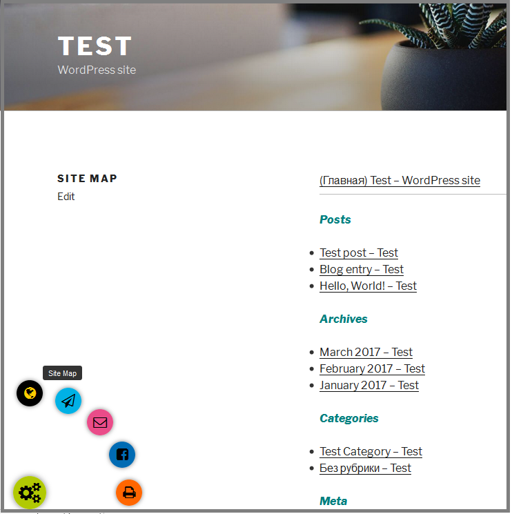
We will create a menu on our test site with various additional functions. For its implementation we use the modern WordPress plugin Bubble Menu Pro. It allows to easily design and customize the navigation menu of any complexity. In just two clicks, the user will be able to find the material that interests him.
The plugin is well compatible with other functional web applications. Its helps you to create unique and bright menus. Define the items for the additional navigation bar:
- Site Map – the link to the page with the test site map.
- Subscribe – the button to output the modal window with the subscription form.
- Contact Us – the menu item with the link to the page with the contact form.
- Share on Facebook – allows you to share interesting articles with friends and subscribers of the user in the Facebook.
- Print a web page – the printing function for the convenient work with the information.
Use the “Add new” button to create a new bubble menu with the name “extra-menu”. In the “Style” we set general parameters of the navigation display:
- in the “Position” choose menu item with 5 elements and the location in the bottom left corner from the proposed options;
- in the “Select Icon” field set the icon corresponding to its functional value;
- show the display of the menu and its items in the circle form (Button shapes> Circle);
- select the animation effect when the navigation button opens and closes with the “Animation effects”;
- set the color of the element and its highlight when hovering the mouse. We use the “Color” and the “Hover color” parameters for this.

The additional menu can be used to separate the category of the settings or the user actions. The Bubble Menu Pro allows web designers to work out the unique style of the site, apply new ideas.
1. Use the pages links as navigation
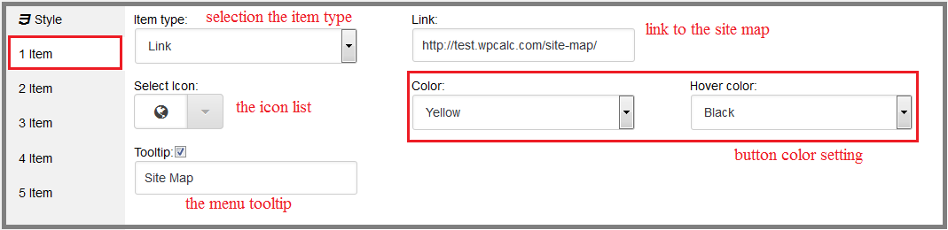
The first and the third menu item are set by links to different pages of the test site. They will lead to the map of the web resource and its contact form, respectively. For the Site Map:
- set the element type as the link;
- in the “Link” field enter the address of the page with the site map;
- use the “Select Icon” to select the thematic icon to display on the button;
- use the tooltip. In the “Tooltip” field enter “Site Map”;
- select the yellow color for the button and leave the black color by default when hovering.
To create the button “Contact Us” the similar type of element is used. Specify in the settings:
- the link to the page with the form of communication;
- the unique thematic icon;
- the tooltip for the user “Contact Us”;
- the pink color for the decoration.

Use the links to create the menu items is a common practice in the Internet. This is the best option for quick navigation on the main pages of the site.
2. Enable the modal window with the form to menu
The second item is the function of subscribing to the web resource newsletter. Let’s diversify a little bit the way the user interacts with the menu. Add the output of the modal window with the connected form instead the page link. To implement the element, we will also take advantage of the capabilities of the plugins: to create modal windows Wow Modal Windows Pro and to create various kinds of forms – Wow Forms Pro.
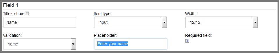
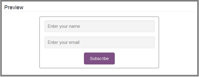
Use the Wow Forms Pro to create the simple subscription form with two required fields. To add the first field with the “Form” menu indicate:
- the field title «Name» as the required attribute for transferring form data. Let’s leave it hidden by default;
- the type of element as the input field (Input);
- the validation to correct the name input field;
- the maximum width;
- the placeholder for the user – “Enter your name”;
- the field as the required field by setting the flag.
The second field will be used to specify the user’s email address. To configure it, select the next field values:
- the field title – Email;
- the validation to correct the email input field;
- the type of the field to enter text data;
- the maximum width;
- the placeholder – «Enter your email»;
- define the field as required.

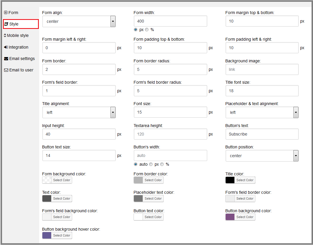
Set the settings for the external appearance of the form in the “Style” menu:
- define the outer and the inner indents in the 10 px;
- center the location of the element;
- the width – 400 px;
- the border width (2 px) and the degree of its rounding (5 px);
- the border width (1 px) and the degree of its rounding (5 px) for the form fields;
- the font size – 15 px;
- place the placeholder on the left;
- the button height in 40 px and its location in the center of the form;
- the button text is “Subscribe”;
- the background color and the borders color of the form, its fields, text and placeholders.
The other settings in the menu section leave by default.
Set the email options for sending the letter to the site administrator, the error message and the successful subscription in the “Email settings“:
- set the checkboxes to send the message to the administrator and to add it to the list of plugin database;
- set the text “Correct the fields, please” to output when the user enters the wrong data format;
- specify the error message font size in 16 px and leave the text red by default;
- enter the time of notification output in 3 seconds;
- set the receiver of the letter, the subject and the message text.

If the subscription is successful, the user will receive the confirmation letter on its email. The sending options are set with the “Email to user“:
- put a checkbox to send the message to the user;
- enter the sender address;
- enter the message subject and the sender name;
- enter the letter text.

The subscription form will make it possible to interest site visitors with the new articles and the individual newsletter. The Wow Forms Pro plugin automatically generates the shortcode for inserting the object anywhere in the web resource. It helps to attach the created form to the modal window.
Create the pop-up window with the WordPress plugin Wow Modal Windows Pro that will become the container for the form. Use the “Style” menu to external design. Install it:
- the window width – 30%;
- the padding 10 px;
- the border width 2 px and the degree of its rounding 5 px;
- the element position at the bottom of the page – 10%, and relative to the right side – 40%;
- the background and border color.

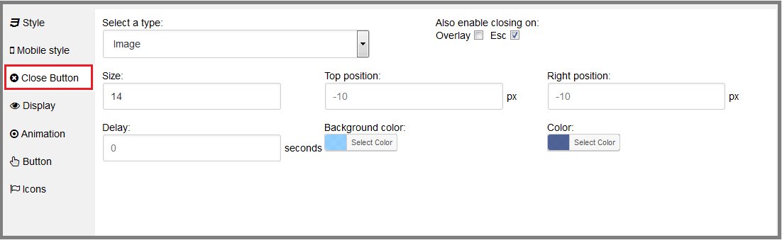
Change the closing button appearance for the harmonious display of the pop-up block:
- set the size to 14;
- add the closing by pressing the Esc button;
- change the background color and the graphic element.
In the “Display” section change the modal window show settings when the link is clicked. The submitted code with the element id will be used for integration into the additional menu of the site.

Add beautiful effects when the pop-up block appears and closes with the “Animation” item. Choose the animation in the list and specify its duration to 400 ms.

Generate the icon shortcode to use in the pop-up block. Select and specify the parameters:
- the icon variant from the extended list;
- the graphic element color;
- the size – 24 px.
Add shortcodes of the created subscription form and the icons to the text editor of the modal window.

The result of saving all the settings is the following modal window:

Insert the received with the “Display” menu link in the Link field of the second element of the additional menu. Other settings are the same as for the page links. Change the color design, the icon and the tooltip to “Subscribe”.

3. Ability to share via social networks
Advanced users often share the found useful information in the Internet. One of the largest social networks Facebook allows you to share interesting findings with your friends and subscribers. Creating the button on the site will provide the increase in its conversion:
- set the item type «Share»;
- select Facebookin the Social Networks tab;
- select the corporate logo with the list of icons;
- add the tooltip – “Share on Facebook”;
- change the element color in the normal and active state.

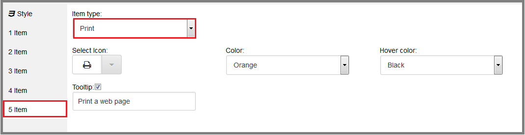
4. The print function in the Bubble menu
The print function will be extremely useful in the menu. It will allow the user to print important information on the paper from the site pages. To connect it, we use:
- the element type – Print;
- the thematic icon from the list;
- the tooltip for the user – «Print a web page»;
- the color design.
Save all settings and get ready-to-use menu on the site. The items appear after pressing the main button.