Install and Activate
Free version:
Via the Plugin Admin Dashboard
- From the WordPress Admin screen, go to ‘Plugins’ >> ‘Add New’.
- In the ‘Search Plugins’ custom field, search for Floating Button.
- Select ‘Floating Button’ by Wow-Company. Click on the ‘Install Now’ button.
- Click on the ‘Activate’ button to activate the plugin on your site.
Via the WordPress.org Plugin Repository
- Visit the ‘Floating Button’ plugin page in the WordPress.org plugin repository.
- Select the ‘Download’ button to download a zip archive of the plugin to your computer.
- From the WordPress Admin, go to ‘Plugins’ >> ‘Add New’ and at the top of the page, select the button labeled ‘Upload Plugin’.
- On the ‘Add Plugins’ page, follow the prompts to upload your zip archive to the plugin directory on your site.
- Install and activate the plugin.
Via a File Transfer Protocol (FTP) Client
To install Popup Maker manually via an (S)FTP client, see the Manual Plugin Installation guide on the WordPress Codex.
Pro versionPro
- Download the PRO version via the link in the email or in your dashboard on Wow-Estore.com
- Install the PRO version from the WordPress Admin, go to ‘Plugins’ >> ‘Add New’ and at the top of the page, select the button labeled ‘Upload Plugin’
- On the ‘Add Plugins’ page, follow the prompts to upload your zip archive to the plugin directory on your site.
- Activate the Pro version
- Deactivate the Lite version
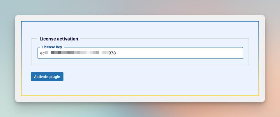
- Go to the plugin page
- Enter the license key
- Click the button ‘Activate License’
Button types
The plugin features an array of button types, designed to facilitate the creation of more dynamic and interactive actions.
- Main Button – This feature allows the opening of sub-buttons when clicked.
- Link – Insert the desired link onto your button. The upgraded Pro version of the plugin also offers the option to open this link in a new window for a seamless browsing experience.
- Login – Generates a redirect to the default WordPress login page. You can also specify a redirection link for after successful login.
- Logout – Creates a logout link. Similarly, you can provide a redirection link that will activate post-logout.
- Register – Provides a shortcut to the default WordPress registration page.
- Lost Password – Generates a convenient link to the default WordPress password reset page.
- ProShare – Use up to 33 different social sharing services to spread your page content across the internet.
- ProTranslate – Employ Google Translate to translate your page into a selected language, broadening your audience reach.
- ProNext Post – This feature generates a link to the next available post.
- ProPrevious Post – This option produces a link to the previously published post if one exists.
- ProPrint – Enable users to print the page directly from the website.
- ProScroll to Top – This feature allows users to effortlessly scroll back to the top of the page.
- ProScroll to Bottom – This function provides a convenient way to navigate to the bottom of the page.
- ProGo Back – A handy tool that directs users back to the previous URL in their browser’s history.
- ProGo Forward – Lets users move forward to the next URL in their history if available.
- ProSmooth Scroll – Facilitates a smooth scroll to any element on the page with a specified ID. Include the ID in the Link field as an anchor, like this: #element-id
- ProMenu – Set which menu will appear in the popup when the button is clicked.
- ProLike Button – Allows users to “Like” your posts, contributing to the reaction count visible for other site visitors.
Tooltips
The plugin offers customization options for tooltips of each button, if needed.
- Tooltip Inclusion: Define whether tooltips should be incorporated for each button within the plugin, providing user-guidance and helpful pop-ups when needed.
- Customization of Tooltip Appearance: Tweaking ‘Tooltip background’ and ‘Tooltip color’ options facilitates design adjustments of each tooltip’s background and corresponding text color respectively, thereby blending with overall aesthetics.
- ProContinual Display: Utilize the ‘Hold open’ feature to keep tooltips constantly displayed, ensuring necessary information remains visible, rather than disappearing after certain conditions.
- ProCustom Sizing: The ‘Custom size’ feature enables setting up unique measurements for tooltips. By default, the tooltip font size would align with the button size. However, this customized size function allows for independent size modifications for the Main button as well as any secondary buttons.
Icons
- Default Setting: The plugin provides built-in FontAwesome icons as a default. Choose the most appropriate icon from this vast collection to match your button aesthetics.
- ProCustom Image: Personalize your buttons further by using a custom image as an icon. To do this, navigate to ‘Image Url’ and opt to either download/select an image from the WordPress Media Library or manually input a direct link to your desired image.
- ProEmoji and Symbols: Inject some fun into your buttons by using the ‘Emoji’ feature. This option lets you use any emoji, HTML symbol, or even a simple letter as your icon.
- ProIcon Class Customization: For those who wish to use an icon library other than FontAwesome Free, our plugin provides an ‘Icon Class’ option. Utilizing this feature, you can set the class of your preferred icon to successfully input it into your button.
Style
Color Customization: Each button offers complete color customization for three elements – the Background, Text, and Icon. The Icon color is applicable when you’ve opted for a Font Icon.
Comprehensive Styling
- Shadow: Enhance the depth and visual impact of your buttons by adding shadows as you see fit.
- Position: Stay in control over where your buttons go with eight distinct position settings: bottom-right, bottom-left, bottom-center, top-right, top-left, top-center, left, and right.
- Button Size: The plugin provides three predetermined button sizes for convenience: Small, Medium, and Large.
- ProShape: Personalize your button’s form factor with four default shape options: Circle, Ellipse, Square, and Rounded Square.
- ProOffsets: Fine-tune your button’s position with positive and negative offset values. This option helps adjust the button’s location vertically and horizontally.
- ProCustom Button Size: Cater to any specific design needs with the freedom to set custom sizes for both the main button and the sub-buttons.
- ProExtra Style: Achieve even greater control over button aesthetics with the ability to add custom styles to the page. If you need assistance, our Support page is open for contact, or you may leave a question in the Disqus section at the bottom of the page.
AnimationPRO
- Icon Animation: This feature allows you to add dynamic flair to the default icons for each button by setting a chosen animation. You can select from a range of seven different animations to make your icons more engaging and interactive.
- Main Button Animation: To capture more attention from your visitors, you can set an animation for the main button. There is a selection of 11 different animations at your disposal to enhance the visual intrigue of your main button.
- Sub-Button Opening Animation: This allows you to configure an animation for when the sub-buttons open. Although the default setting for sub-button opening is ‘Fade’, a variety of 8 different animations are available for you to choose from, enabling you to customize this feature according to your preference.
SettingsPRO
- Scroll-Based Visibility: This feature enables you to define a scroll point on the page at which the buttons will either appear or disappear. This allows you to control when the buttons are visible based on user scroll behavior.
- Time-Controlled Visibility: Implement time-sensitive visibility with this setting, which allows you to specify a timer (in seconds) after which the buttons will either show or hide. This gives you control over the display of buttons based on a predetermined timeframe.
- Page-Click Sub-Button Hiding: This option helps maintain a clean page layout by automatically closing any open sub-buttons when the user clicks anywhere on the page. This avoids the clutter of multiple open sub-buttons when navigating your site.
- Sub-Button Click Hiding: Particularly useful for single-page navigation menus, this feature allows you to auto-hide sub-buttons upon clicking them. This ensures a seamless user experience by preventing the screen from getting crowded with open sub-buttons after they’ve been selected.
- Hide Other Buttons: Enabling this option ensures that upon selecting the primary button, all other floating buttons will be hidden.
Display ConditionsPro

WP Coder offers a versatile set of Display Conditions options, giving you granular control over when and where your custom code is implemented on your WordPress site. These conditions include:
- Display Rules: This option lets you control the specific pages, posts, or other areas of your site where your custom code will run. For instance, you can set your code to run only on specific posts, only on your homepage, or everywhere except a certain page.
- Devices Rules: With this feature, you can decide on which devices your custom code will run. This is particularly useful for implementing code that enhances or optimizes the user experience for specific devices, such as mobile phones or tablets.
- Users Rule: This option allows you to control which users see the effects of your custom code based on their user role. For example, you might want to implement certain changes that only administrators or subscribers will see.
- Browsers Rules: This feature enables your code to run only on specific browsers. It’s handy when you have certain scripts or styles that work better or are only needed on specific browsers.
- Schedule: This powerful feature allows you to control when your code is implemented based on a specific schedule. You can set start and end dates and times, allowing you to seamlessly run holiday-themed changes, timed promotions, or any other temporary changes.
- Depending on the language: With this feature, you can run your custom code based on the language of your site. This is particularly useful for multilingual websites where you may want to apply different scripts or styles for different languages.
With these options, you have the flexibility to ensure that your custom code executes precisely under the conditions you specify, enhancing your site’s performance and user experience.
Publish

The Floating Button plugin includes a variety of Publish Options that give you complete control over how and when your item is used on your site. These options include:
Status (activate/deactivate): This option lets you easily turn your custom code on or off. This can be helpful when you need to troubleshoot issues or when you want to stop using a piece of code temporarily without deleting it.
Test Mode: With this feature, you can safely test your new code without affecting your live site. When Test Mode is activated, only administrators can see the effects of the code. This is a great way to ensure your code works as expected before showing it to all your visitors.
Insert Tag for Organizing Items (Optional): This option lets you add tag to your items, making it easier to categorize and manage them. This can be especially handy when you have many pieces of items and need an efficient way to find specific ones.
Link to the Page with Item (Optional): This feature allows you to add a link to the specific page where your code snippet will be active. It’s a convenient way to keep track of where your various code snippets are being used across your site.
Shortcode: After you’ve added your custom code, the plugin will generate a unique shortcode. You can use this shortcode to add your code anywhere shortcodes are accepted on your site, such as posts, pages, or widgets. This allows you to easily control where your code is implemented without having to edit your theme files.
These options ensure you can effectively manage and control your custom code, enhancing your site’s performance and the overall user experience.