Button Generator Pro Documentation v 3.2.3
Installing
Once you've completed your purchase, you'll have two ways to download the plugin:
- Email: Check your inbox for an email from Wow-Estore. This email will contain a download link for the plugin.
- Account Dashboard: Alternatively, you can download the plugin directly from your Wow-Estore.com account. Here's how:
- Log in to Wow-Estore.com: Use the login credentials you received in your email.
- Access Your Account Dashboard: Look for a section labeled "Account".
- Find the Downloads Section: Within your account dashboard, locate a section titled "Downloads,".
- Download the Plugin: You should see a list of your purchased products, including the plugin. Locate the specific plugin and click the download link associated with it.
Note: In some cases, this file may unzip as you download it, and instead appear as a regular folder. However, the folder must be zipped to use the WordPress plugin uploader. For more details on how to zip and unzip files, be sure to check out these guides for Windows and Mac operating systems.
Once you’ve downloaded your zip file, go ahead and navigate to the site where you’d like to install PRO plugin. Then, inside the admin dashboard, go to Plugins \> Add New (1) and click the Upload Plugin (2) button.

From here, you’ll see the option to upload the plugin. Click on the Choose File button and select the Pro plugin zip file you just downloaded. After your file is uploaded, click on the Install Now button

This will begin the installation process for you. Once the plugin is installed, click on the Activate Plugin button to activate Pro plugin on your site.

After activating the plugin, be sure to activate your PRO plugin license key to receive automatic updates and plugin support.
- Go to the page 'Wow-Plugins' in dashboard
- Select the plugin
- Enter your license key, that you recived in email
- Click the button 'Activate plugin';

Congratulations! You've successfully installed and activated the PRO plugin. Now, you can start exploring its features and take your WordPress site to the next level.
Settings
Content
- Appearance: Choose what elements your button will display:
- Text Only: Button will only contain text.
- Text & Icon: Button will display both text and an icon.
- Icon: Button will only display an icon (no text).
- Tooltip: Enter the text that appears when hovering over the button. Select where the tooltip will display: Top, Bottom, Left, or Right.
- Text: Enter the text you want to display on the button.
- Text location: Choose where the text appears relative to the icon (if applicable):
- Before Icon: Text displays to the left of the icon.
- After Icon: Text displays to the right of the icon.
- Above Icon: Text displays above the icon.
- Below Icon: Text displays below the icon.
- Gap: Set the amount of space between the text and the icon (if applicable). Enter a value.
- Icon: Choose how you want to define the button's icon:
- Icon: Select an icon from the Font Awesome library.
- Class: Enter a CSS class for an icon from another icon font library.
- URL: Provide the full URL to an image you want to use as the icon.
- Emoji: Enter an emoji or letter to use as a simple icon.
- Rotate icon: Set the angle (in degrees) to rotate the button's icon.

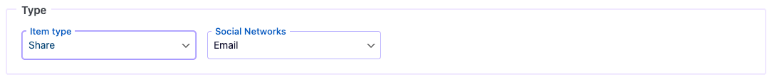
Type
- Link: Create a link to any page on your website. You can also choose to open the link in a new window.
- Next Post: Generate a link to the next post within the current post's category.
- Previous Post: Generate a link to the previous post within the current post's category.
- Share: Create a link with sharing options for social media. Choose from 29 different social media services.
- Translate: Offer your users the ability to translate your page in real-time.
- Download: Download the intended file by bypassing their browser's default behavior of potentially opening the file in a new tab or window.
- Print: Provide a link for printing the current page.
- Scroll To Top: Create a smooth-scrolling link that takes users to the top of the page.
- Scroll To Bottom: Create a smooth-scrolling link that takes users to the bottom of the page.
- Smooth Scroll: Enable this option for a more pleasant user experience when navigating a page with anchor links.
- Go Back: Allow users to navigate back to the previous page in their browser history.
- Go Forward: Create a link to the next page in the user's browser history.
- Login: Create a link to your site's login page.
- Logout: Create a link for users to log out if they are currently logged in.
- Lost Password: Create a link to the password reset page for users.
- Register: Create a link to the user registration page on your site.
Attributes
You can set various link attributes such as ID and class.

Google Events Tracking
Integrate Google Events Tracking to monitor user interactions with your button. You'll need to have a Google Analytics tracking code installed on your site to use this feature.
Here's a breakdown of Google Events Tracking:
- Category (required): The object the user interacted with (e.g., "button").
- Action (required): The user's action (e.g., "click").
- Label (optional): Additional categorization (e.g., "affiliate link").
- Value (optional): A numeric value associated with the click.
Style
Empower yourself with Button Generation's extensive styling options. Craft the perfect button look to match your website's design and elevate your call-to-actions!

General Styles:
- z-index: Control the stacking order of your button relative to other elements on the page. Higher values appear on top.
- Rotate Button: Spin your button a specific number of degrees for a unique visual effect.
- Width/Height: Set the button's width and height using pixels (px), percentages (%), or other CSS units.
Colors:
- Icon Color: Define the color of your button's icon.
- Icon Hover Color: Change the icon color when someone hovers over the button.
- Text Color: Specify the color of your button's text.
- Background: Choose the base background color for your button.
- Hover Color: Set the text color that appears when hovering over the button.
- Hover Background: Set the background color that appears when hovering over the button.
Borders:
- Radius: Adjust the rounded corners of your button for a softer or sharper look. Use units like pixels (px) or percentages (%) for precise control.
- Style: Select the desired border style (e.g., solid, dashed, dotted).
- Color: Define the color of your button's border.
- Thickness: Set the width of your button's border in pixels (px) or other units.
Drop Shadow:
- Shadow: Activate a drop shadow for your button. Choose between "none" (no shadow), "outset" (shadow appears outside the button), or "inset" (shadow appears inside the button).
- Shadow Position: Fine-tune the horizontal and vertical placement of the shadow using pixels (px).
- Blur: Adjust the blurriness of the shadow for a softer or sharper effect (pixels).
- Spread: Control how far the shadow spreads beyond the button (pixels).
- Color: Define the color of your button's drop shadow.
Font:
- Icon Size: Set the size of your button's icon in pixels (px) for optimal visibility.
- Font Size: Choose a suitable font size (px) for your button's text to ensure readability.
- Font Family: Select a font that complements your website's design. Choose from popular options like "Use Your Themes" or specific fonts like Tahoma, Georgia, etc.
- Font Weight: Adjust the boldness of your button's text. Choose from options like "normal" for regular weight or bolder options like "700" for a strong emphasis.
- Font Style: Select whether your button text should be displayed in "normal" or "italic" style.
Remember: Experiment with these styling options to create unique and impactful buttons for your website!
Effects
Make your buttons stand out and capture user attention with Button Generation's dynamic effects!

Attention Grabbers:
- Animation: Spice up your button with a cool animation effect! Choose from various animation types to make your button pop and attract user clicks.
- Duration (seconds): Fine-tune the animation speed using seconds (s) to achieve the desired visual impact. A faster duration creates a more energetic effect, while a slower one offers a smoother and more subtle animation.
- Animation Count: Set the number of times the animation will repeat. Set value 0 as "infinite" for continuous animation or a specific number for a controlled effect.
- Animation Delay (seconds): Introduce a slight delay (in seconds) before the animation starts, creating a sense of anticipation or building suspense.
Additional Effects:
- Transition Duration (seconds): Control the smoothness of the transition between button states (normal, hover, etc.) using seconds (s). A faster duration creates a snappier transition, while a slower one offers a more subtle change.
- Transition Function: Select the desired transition effect for your button. Explore different options to achieve unique visual transitions.
- Hover Effect: Add subtle visual changes when users hover over your button. This can improve user interaction and encourage clicks.
- Background Hover Effect: Define what happens to the button's background color on hover. Experiment with color changes or transparency effects.
- Icon Hover Effect: Animate or change the color of your button's icon on hover for a more interactive experience.
- Border Hover Effect: Modify the border style or color of your button on hover to create a visual cue or emphasize the button when users interact with it.
Pro Tip: Use these effects strategically to avoid overwhelming users. Subtle animations and hover effects can be most effective in attracting attention without being distracting.
Badge
Button Generation empowers you to add informative badges to your buttons, providing additional context and value to users.
Badge Options:
- Badge Type: Choose the type of badge you want to display:
- Text Badge: Add a simple text badge with a custom message.
- Action Badge: Display a dynamic badge that tracks the number of times the button has been clicked. This can create a sense of urgency or social proof.
- Badge Text: Customize the text message you want to display on the badge or start number counter.
Badge Style:
- Width/Height: Set the size of your badge using pixels (px), percentages (%), or other CSS units for optimal positioning.
- Color: Define the color of your badge's text or icon.
- Background: Choose the background color for your badge to make it visually distinct from the button.
Badge Positioning:
- Top Offset: Control the vertical distance between the badge and the top edge of the button using pixels (px). A positive value places the badge below the button, while a negative value positions it above.
- Right Offset: Adjust the horizontal distance between the badge and the right edge of the button using pixels (px). A positive value moves the badge to the left, while a negative value positions it to the right.
Borders:
- Radius: Adjust the rounded corners of your badge for a softer or sharper look. Use units like pixels (px) or percentages (%) for precise control.
- Style: Select the desired border style (e.g., solid, dashed, dotted).
- Color: Define the color of your badge border.
- Thickness: Set the width of your badge border in pixels (px) or other units.
Font:
- Font Size: Choose a suitable font size (px) for your badge text to ensure readability.
- Font Family: Select a font that complements your website's design. Choose from popular options like "Use Your Themes" or specific fonts like Tahoma, Georgia, etc.
- Font Weight: Adjust the boldness of your badge text. Choose from options like "normal" for regular weight or bolder options like "700" for a strong emphasis.
- Font Style: Select whether your badge text should be displayed in "normal" or "italic" style.
Remember: Utilize badges strategically to provide valuable information to users without cluttering your buttons.
Targeting & Rules
The Targeting & Rules section gives you ultimate control over where and when your buttons appear on your WordPress website. This allows you to deliver a targeted user experience by showing specific buttons in relevant locations.
Button Type
Type: Choose the type of button you want to create:
- Standard Button: This button is typically placed inline with your website content.
- Floating Button: This button remains visible and "floats" on a specific location on your webpage, regardless of scrolling.
Standard Button Targeting
Placement Options: Define where you want your standard button to appear:
- Shortcode Placement: Use a shortcode to insert the button directly into your posts, pages, or any other area that supports shortcodes.
- After Content: Display the button after your content (e.g., at the end of a blog post).
- Before Content: Show the button before your content (e.g., at the beginning of a blog post).

Floating Button Targeting:
- Location: Choose the desired on-screen location for your floating button.
- Top: Positions the button at the top of the screen with a customizable offset from the top (in pixels).
- Left: Anchors the button to the left side of the screen with a customizable offset from the left (in pixels).
- Right: Positions the button at the right side of the screen with a customizable offset from the right (in pixels).
- Bottom: Anchors the button to the bottom of the screen with a customizable offset from the bottom (in pixels).

Display Rules
- Shortcode: Integrate the item using a shortcode within your page or post content. This offers granular control over placement.
- Everywhere: The item will be visible across all your website's pages.
- All Posts: The item displays exclusively on post pages.
- Selected Posts: Target specific posts by entering their unique IDs. Separate multiple IDs with commas.
- Post Has Category: The item appears on posts belonging to the chosen category. Enter the category ID.
- Post Has Tag: The item displays on posts with the selected tag. Enter the tag ID.
- Page Type: Select the page types where the item will be displayed. Options include Homepage, Posts Page, Search Pages, and 404 Pages.
- All Archives: The item appears on all archive pages.
- All Categories: The item displays solely on category pages.
- All Tags: The item displays solely on tag pages.
- All Dates: The item appears exclusively on date archive pages.
- All Authors: The item displays on all author pages.
- Category, Tag, Author: Target the item to specific taxonomies by entering their IDs.

Responsive Visibility
- Hide on Smaller Screens: Conceal the item on devices with screen sizes below a custom value you define.
- Hide on Larger Screens: Hide the item on devices with screen sizes exceeding a custom value you set.
- Remove on Mobile: Completely remove the item from mobile devices.
- Remove on Desktop: Completely remove the item from desktop devices.

Enable for Specific Language
This option allows you to restrict the floating item's visibility to specific languages on your multilingual website. If enabled, you'll be able to choose the languages where the item should appear.
Disable Font Awesome Icon
By default, Float item Pro utilizes Font Awesome icons. Enabling this option will disable these icons, providing a cleaner look or allowing you to integrate your own custom icons.

Permissions
- Select User Roles: Choose the user roles (e.g., Administrator, Editor, Author) who can see the item on the page.

Schedule
- Set Schedule: Define a schedule for the item's visibility. Specify the days of the week, time of day, and specific dates for display.

Hide Based on Browser
- Select Browsers: Choose specific browsers (Opera, Chrome, Edge, Safari, Firefox, Internet Explorer, etc.) where you want to hide the item.

Other Options
Fine-tune your item: Manage visibility, testing, organization, and data transfer with these additional options.
- Status: Deactivate: Deactivate the menu from appearing on the frontend of your website.
- Test Mode: Enable this option to display the item only for administrators, allowing you to test its functionality on your live site without affecting visitors.
- Tag: Assign tags to your items for easier searching and organization within the list of elements.
- Link: Insert the link to the page with the Item

List of Items
- Bulk Actions: Perform actions on multiple menus at once. Options include Activate, Deactivate, and Enable/Disable Test Mode.
- Duplicate Item: Quickly create a copy of an existing menu for faster editing.
- Export: Export selected menus to a JSON file. This allows you to save backups or transfer menus to other websites using the plugin.

Import/Export
- Export: Export all your items to a single JSON file for backup purposes or transferring them to other websites.
- Import: Import items from a JSON file. This allows you to import previously exported items or item from other websites using the plugin.
- Update Item if Item Already Exists: When importing items from a JSON file, enable this option to update existing items on your site with the imported data.

FAQs
This issue occurs when the license key is either expired or not activated on the current site URL.
📌 Possible reasons:
- The license key is expired.
- The plugin was installed on a temporary URL, and the site was later moved to a different domain.
- The license is not activated on the correct URL.
✅ How to fix it:
- Log into your account on Wow-Estore.
- Go to “Account” → “License Keys”.
- Click on “Manage Sites” for your license key.
- Add or remove URLs for the license as needed.
- Once the correct URL is assigned, retry the update.
🚀 Your plugin should now update successfully!
Make sure Test Mode is turned off. When Test Mode is active, the buttons are visible only to site administrators and hidden from regular visitors.
For multisite installations, don’t activate Button Generator Pro network-wide. Instead, activate it individually on each site where you plan to use it.
No. Button Generator Pro is lightweight and optimized for maximum speed and performance, ensuring minimal impact on your site’s loading time.
Changelog
= Version 3.2.3 =
- Fixed: grammar error in ListTable
- Fixed: wrong variable type in ListTable
- Changed: method for output of buttons styles
= Version 3.2.2 =
- Fixed: includes style via shortcode
- Updated: Helpful links in the settings page.
- Updated:
wp-color-picker-alphato version 3.0.4.
= Version 3.2.1 =
- Fixed: minor bug
= Version 3.2 =
- Added: Aria Label attribute for menu item
- Added: link to changelog
- Updated: Icon in the admin menu
= Version 3.1.1 =
- Updated: FontAwesome Icon to version 6.6
= Version 3.1 =
- Added: File Name for Download Type: Added a new field to specify the file name when the button type is set to \'Download\'.
- Added: URL Contains: Introduced display rules to show the button only on specific URLs, allowing for more targeted user experiences.
- Added: Referrer URL: Added the ability to target users who arrive at your website from a specific referring domain.
- Improved: Style and JS Downloads: Enhanced the download process for styles and JavaScript files.
= Version 3.0.1 =
- Fixed: create styles when update to Pro version
= Version 3.0 =
Read More about version 3.0- Added: New Button Types: Next/Previous links, Translate, Force Download
- Added: Dynamic Hover Effects: Hover effects for Icon, Background, Border
- Added: Custom icon: Font Awesome Icon, icon class, image, emojis
- Added: Effortless Button Transfer: Share your button creations across websites with the new Import/Export tool
- Added: Text Placement Precision: Achieve optimal text and icon positioning with the new \"Under\" and \"Above\" options for Text Location.
- Added: Spacing Control: Fine-tune the distance between your button\'s text and icon using the new Gap setting.
- Added: Scheduling - allows you to define specific times and dates when button appear on your website.
- Added: Resource Optimization - download the button on mobile devices or desktops.
- Added: Google Event Tracking - This allows you to track user clicks on specific button within Google Analytics, providing valuable insights into user behavior.
- Added: Status and test mode
- Added: Tag and link options
- Updated: Font Awesome library to version 6.5, ensuring you have access to the latest icon options.
- Improved: Rewritten jQuery code in vanilla JS for improved performance.
- Improved: Refreshed Interface - revamped the plugin\'s dashboard page style for a more intuitive and user-friendly experience.
- Fixed: diligently addressed minor bugs to ensure a flawless plugin experience.
= Version 2.2.1 =
- Fixed: dynamic property for PHP 8.2
= Version 2.2 =
- Updates: FontAwesome to version 6.4.2
= Version 2.1.3 =
- Fixed: line-height and colors properties
= Version 2.1.2 =
- Fixed: minor bugs
= Version 2.1.1 =
- Fixed: save in database
- Fixed: minor bugs
= Version 2.1 =
- Added: tooltip for button
- Added: Attention seekers animation
= Version 2.0.1 =
- Fixed: hover effects for floating button
= Version 2.0 =
- Added: functions: go to bottom, go back, go forward
- Added: share on: draugiem, whatsapp, diaspora, digg, douban, evernote, flipboard, google bookmarks, hacker news, instapaper, line, qzone, renren
- Updated: Font Awesome Icons to version 5.14
= Version 1.3.2 =
- Fixed: option \'Show on devices\'
= Version 1.3.1 =
- Fixed: Devices control
= Version 1.3 =
- Fixed: open the link
= Version 1.2 =
- Updated: Font Awesome Icons
- Fixed: display buttons
= Version 1.1 =
- Added: Open the link in the new window
- Fixed: minor bugs
= Version 1.0 =
- Initial release